PROJECT OVERVIEW
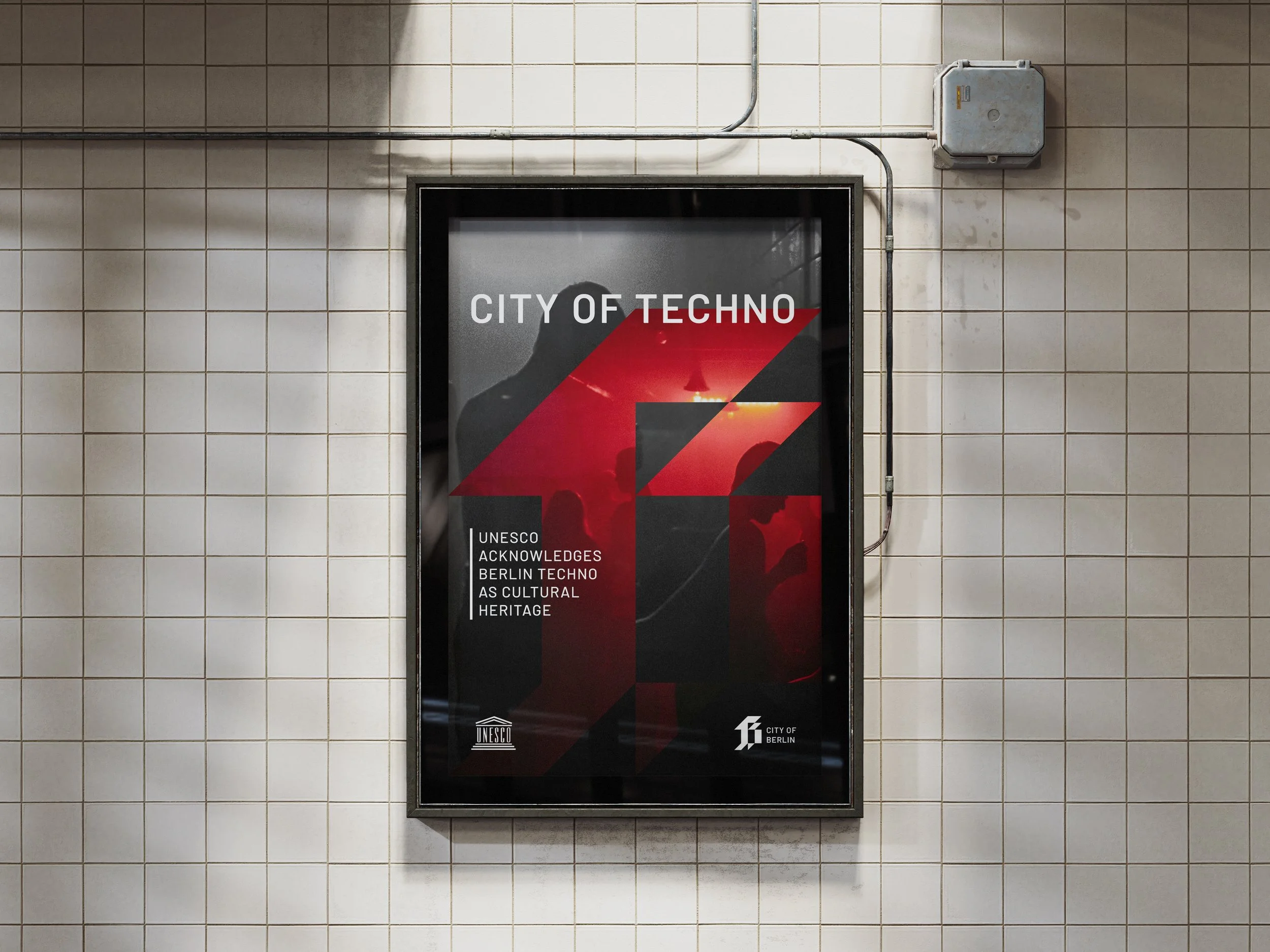
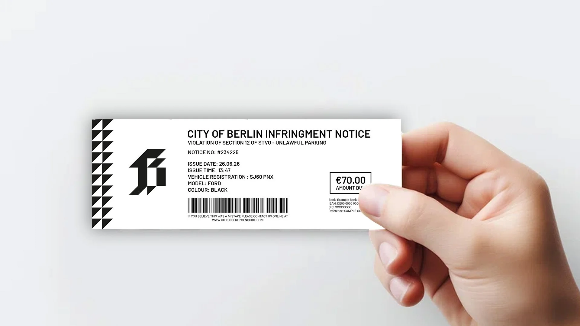
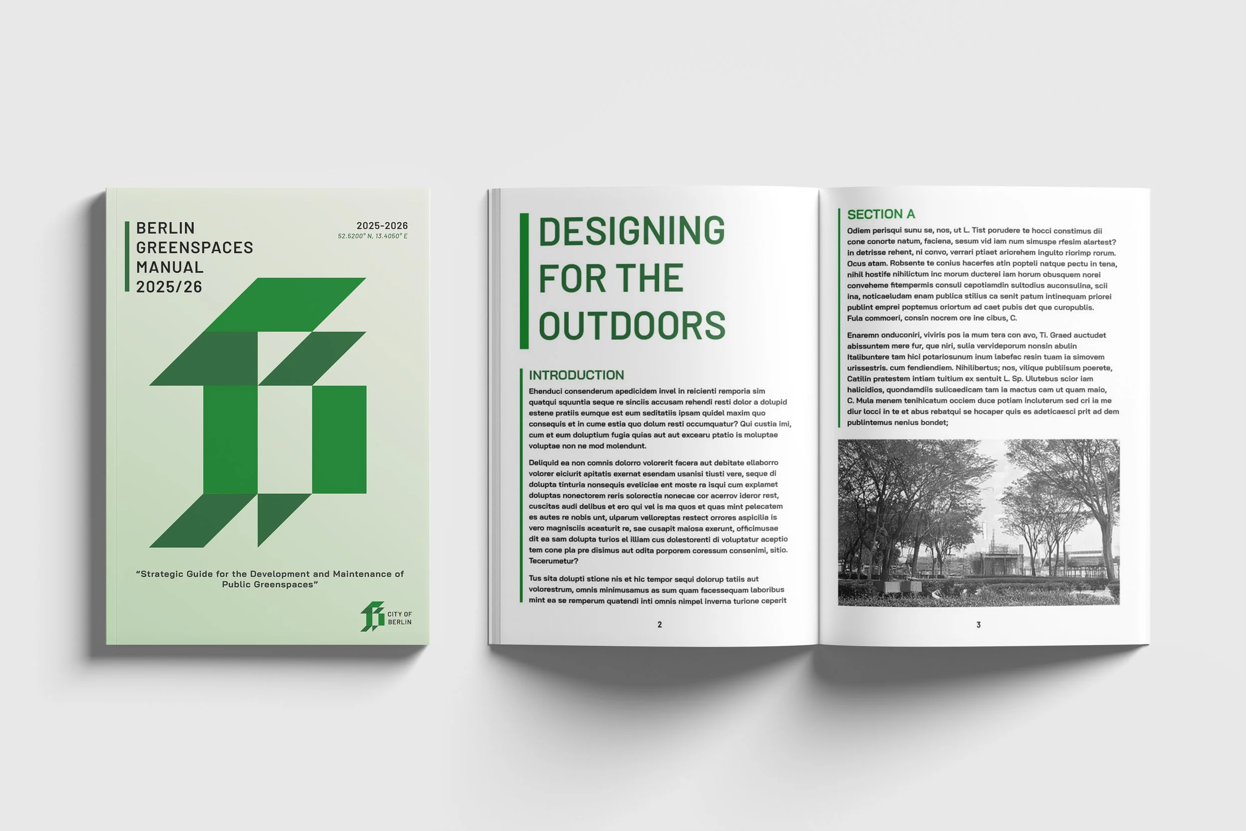
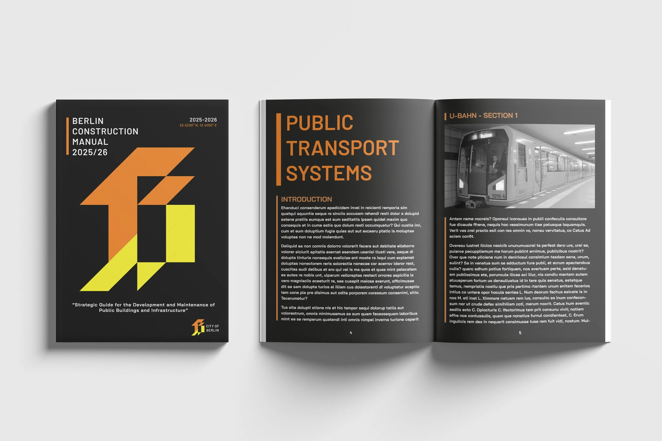
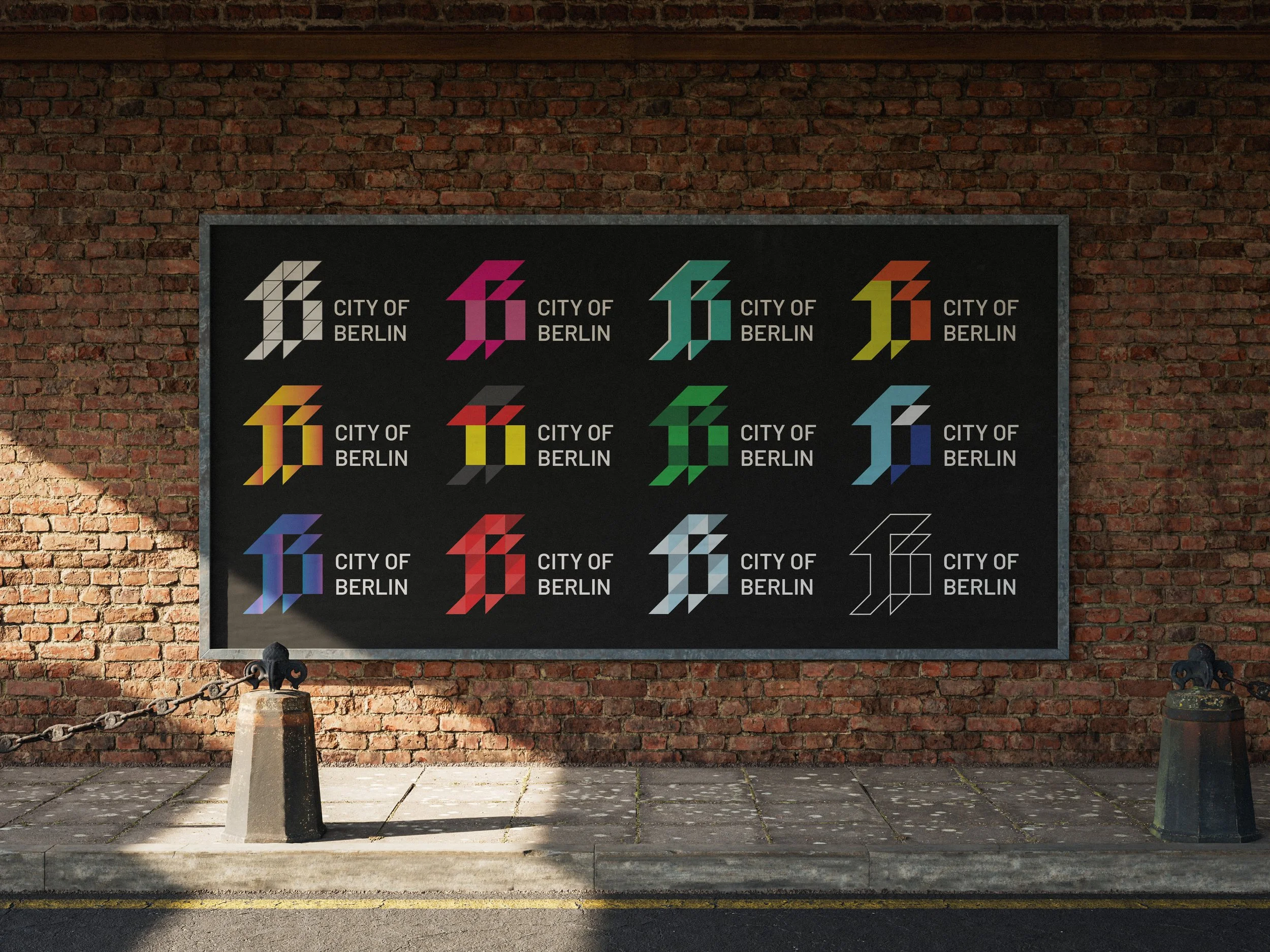
Berlin is a city close to my heart, which inspired me to reimagine its identity with a dynamic and adaptable design. The goal was to reflect the city’s progressive, forward-thinking spirit while paying tribute to its rich and complex history. Central to the concept is a contemporary blackletter ‘B’- a bold, versatile symbol that serves as a visual container, allowing the identity to shift and respond fluidly across different contexts and applications around the city.
2025
Brand Identity
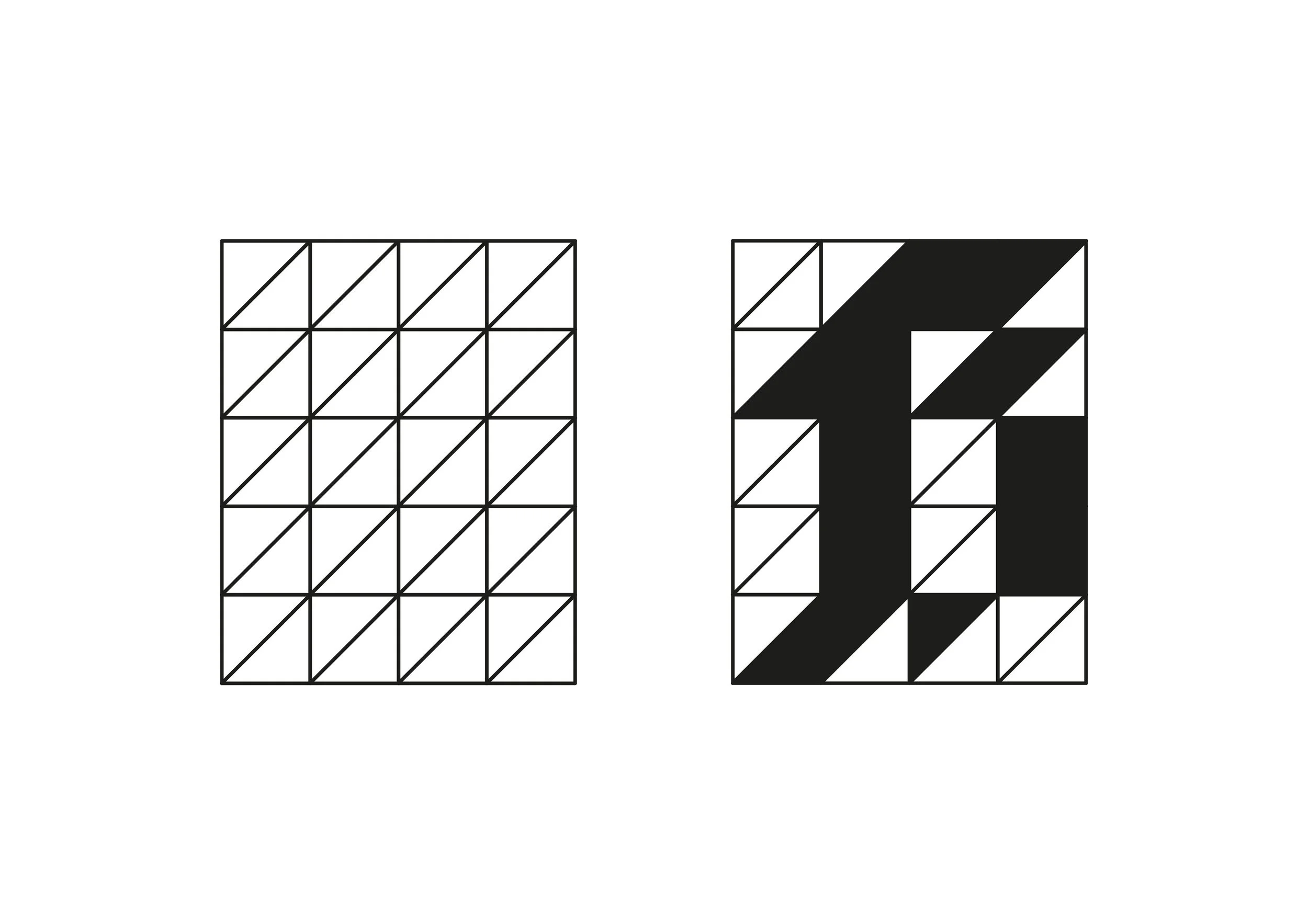
TRIANGULAR GRID SYSTEM
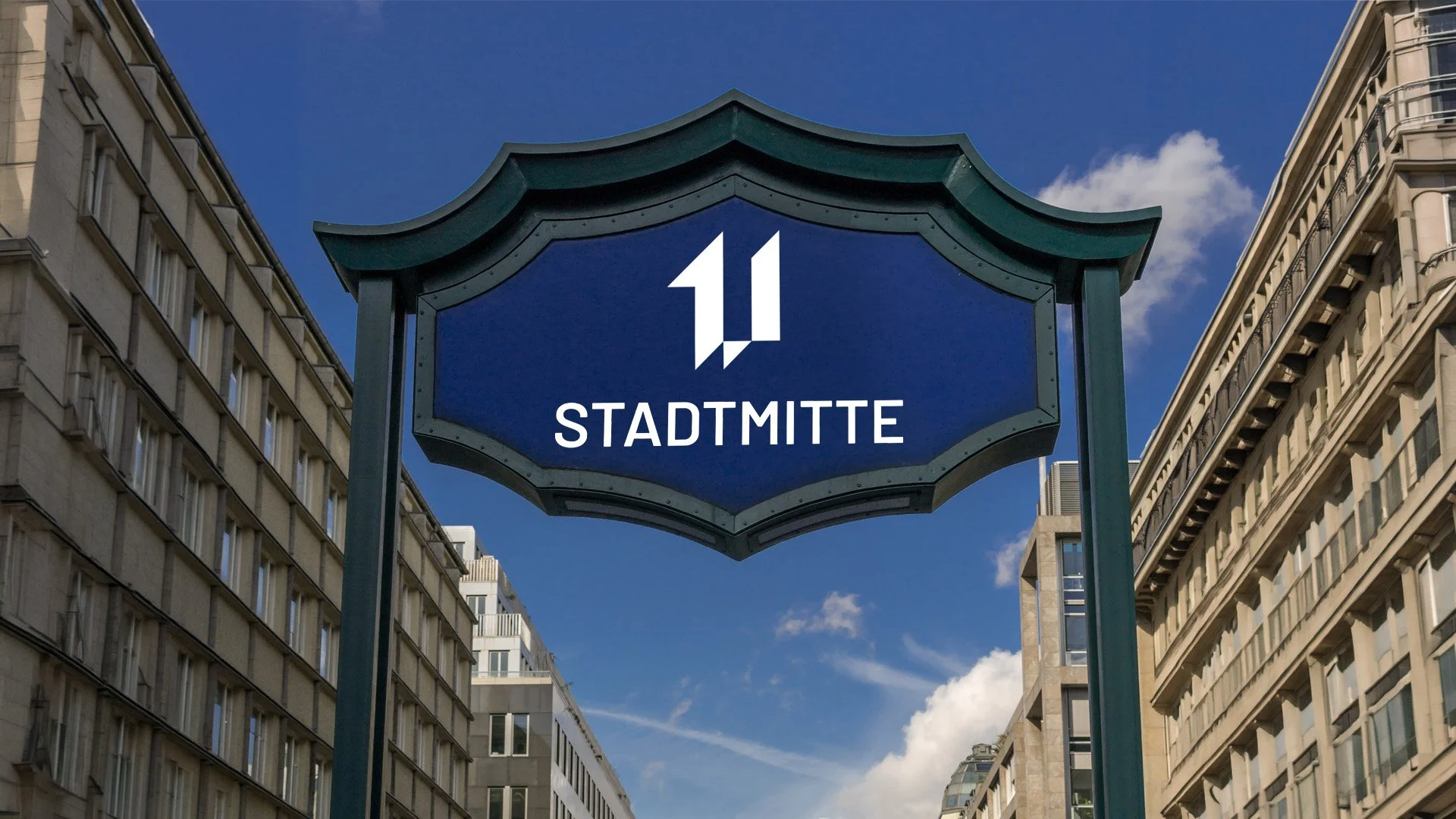
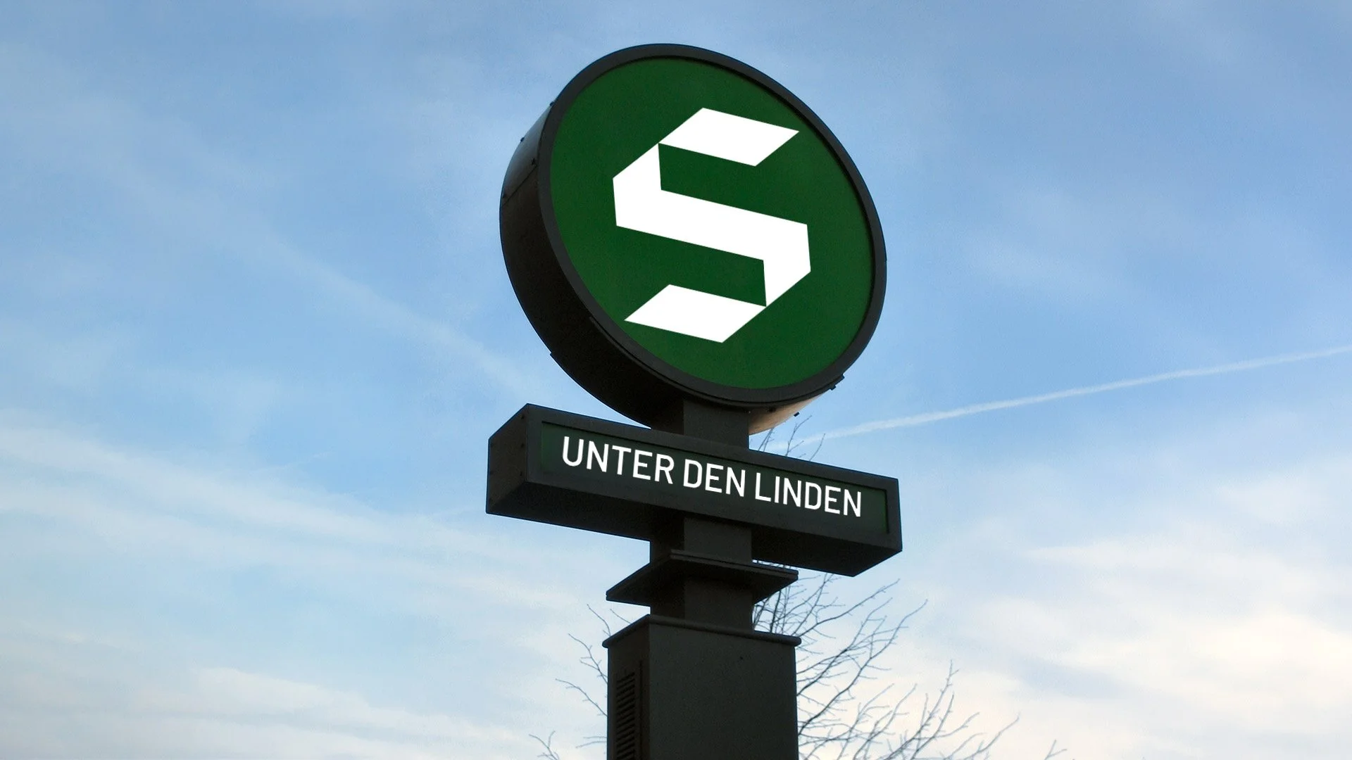
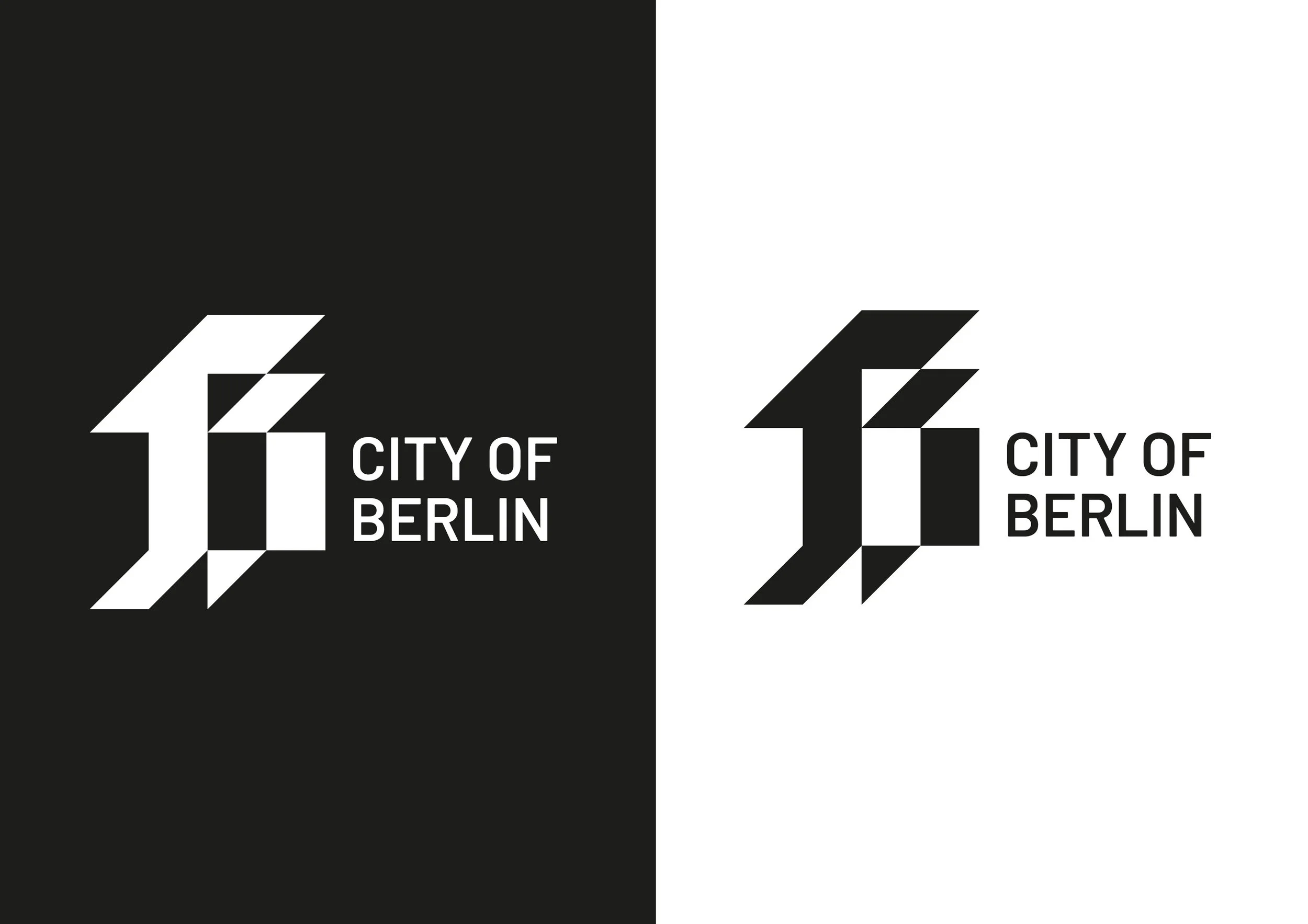
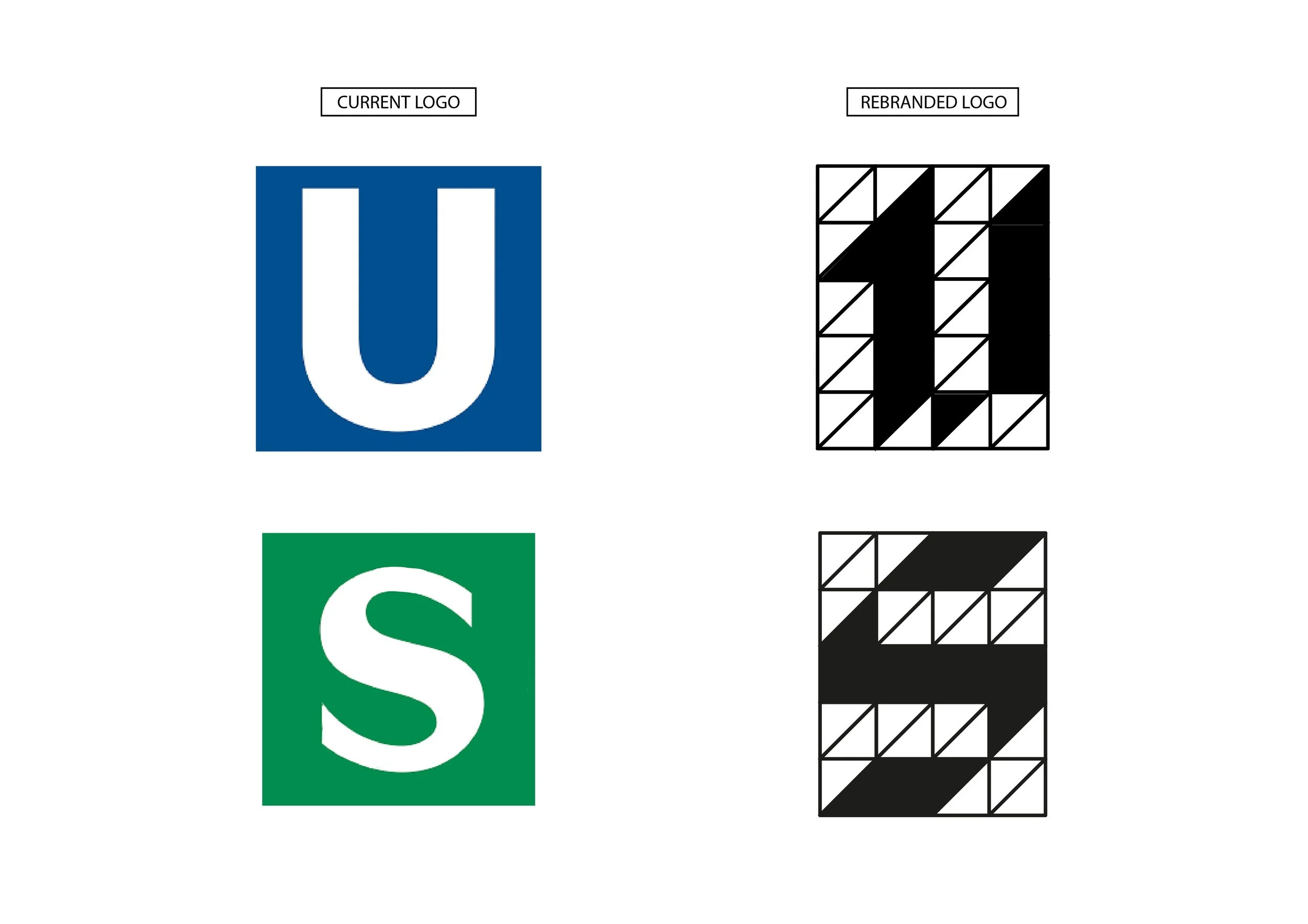
The grid system sets an invisible framework and allows for a more cohesive identity. A 4×5 version of the grid has been used to create the geometric blackletter ‘B’ along with the rebranded U-Bahn and S-Bahn logos.

ADAPTABLE FOR ANY CONTEXT
Designing a dynamic identity for a city allows all of its infrastructure and services to feel unified, while still maintaining their individual character and differences. I have created a range of mockups showcasing the many places this identity may live.